Intro
The blog has been silent for two years. I went through a tough period in my life, and design naturally took a back seat. Today I’m finally coming back and brushing the dust off this place.
I’m excited to introduce a new weekly series — “UX Refresh”. Once a week, I take an everyday app I personally use and propose small, focused interface or UX improvements.
The idea is simple: minimum changes — maximum usability.
Let’s go.
1. What triggered me in the interface
Today’s “guest” is the courier app Wolt Partner.
From personal experience and a brief survey among couriers and restaurant staff, one key issue stood out.
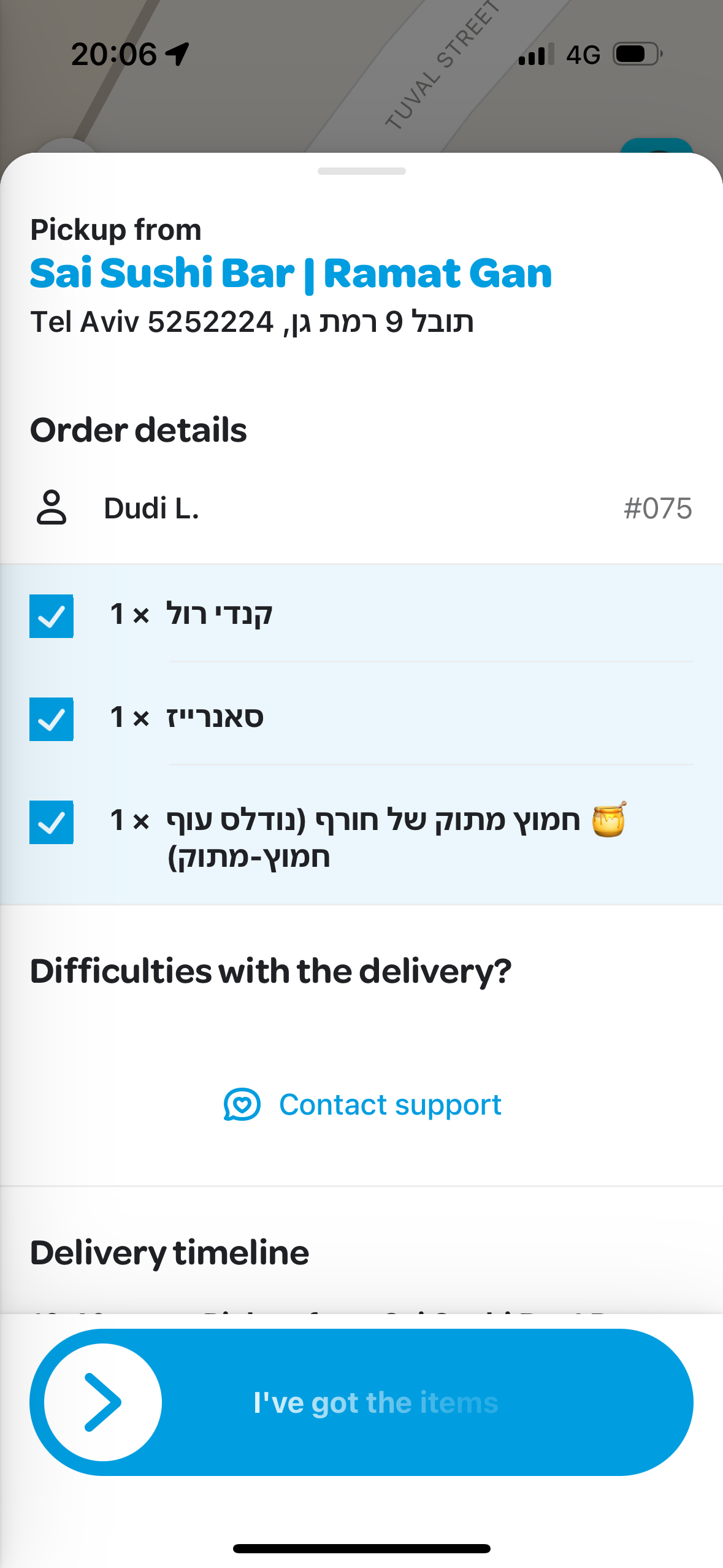
When a courier arrives to pick up an order, staff often ask them to show the screen with the active order number. And here’s the problem: the order number is displayed in a tiny font, and it’s light gray on a white background. It’s easy to miss, especially when things are busy and noisy.

2. Why this is a problem for the user
Critical information should be:
- large,
- high-contrast,
- easy to read.
When the person handing out orders has to look for the number among other UI elements, they waste time. And so does the courier.
It’s a completely pointless delay in the simplest step of the process.
3. What I changed
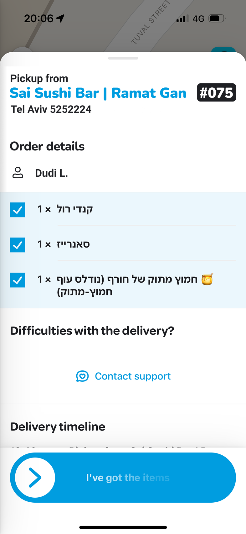
I increased the size of the order number and used the same large font that appears in the restaurant’s name — it’s more logical and much more noticeable.
To improve contrast, I placed the number on a darker background.
The Wolt visual style remains fully intact.

4. How this improves the flow
Now the order number stands out instantly.
The restaurant staff finds the right order faster → the courier leaves for delivery faster → the problem disappears.
A tiny change, but it removes a micro-annoyance in a workflow full of them.
5. What I learned from this small exercise
Critical information should be obvious.
If the user has to “solve” the screen like a crossword, squint, or search for the meaningful parts among the unnecessary — the design is wrong.
The user shouldn’t suffer. 🙂
Bonus
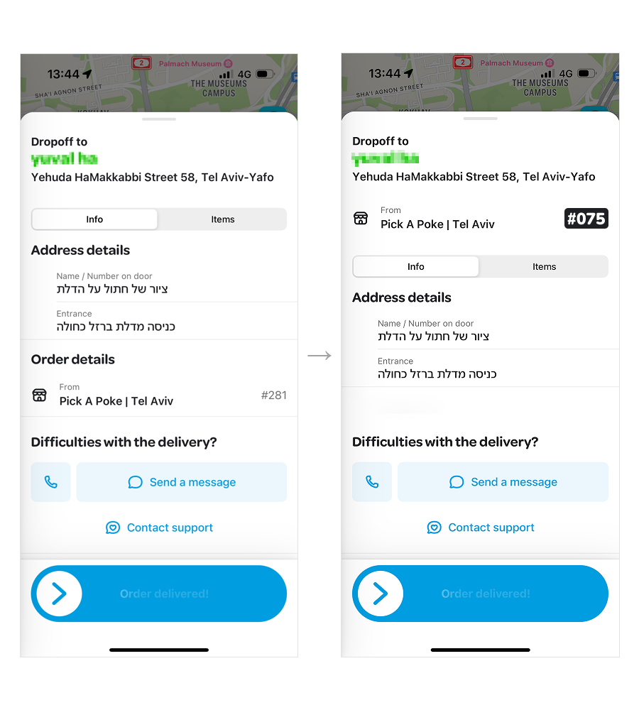
I would also refine the order confirmation screen — the one couriers see after picking up a delivery.
The issue is simple: when a courier has multiple active orders, the order number isn’t immediately visible. It gets lost in the hierarchy, and you need to pause to figure out which item you’re holding.
Here, information priority matters.
At this stage, the most important details for a courier are what they’re delivering and the order number — not who the customer is or where they live. When the bag is full of different orders, finding “what exactly this item is” takes unnecessary time if that info sits lower on the screen.

So I would move the order number to the top, increase its contrast, and place it ahead of secondary details.
This small change helps couriers identify orders faster and reduces friction during busy hours.

