How was Freshly Fresh born?
In order to increase my chances of getting a job, I needed a good case in my UX/UI portfolio. I wanted to show my future employer how I work, how I think, how I solve problems. Just drawing beautiful application screens is not for me. Design is a process.
Freshly Fresh was “born” quite simply. In one of the posts on Medium Kata Kaminska advised try to use website fakeclients.com if there are some difficulties with the idea for the application.
So I decided on the idea of the future application and started working.
Branding
We needed a mobile application with the delivery of products from local stores or greengrocers. But I want to compress frames and leave only the delivery of vegetables and fruits, without a huge list of products available in stores. Need fresh vegetables or fruits? Launch Freshly Fresh! I’m not a marketing department, but I liked the name, it’s simple and highlights the uniqueness of the product. Thus, the name Freshly Fresh was born.
I also didn’t rack my brains over the logo for a long time: if we are talking about vegetables and fruits from the nearest shop, then you can display several vegetables and fruits in a wooden box. We will use green colors – it emphasizes our name and “freshness”.
Research
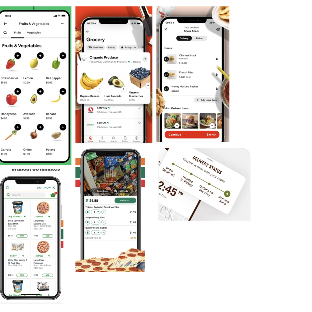
I started researching similar solutions on the market. To do this, I opened the top apps from the “Food” section in the App store and started taking screenshots and notes of useful things that will come in handy in Freshly Fresh.
Prototype
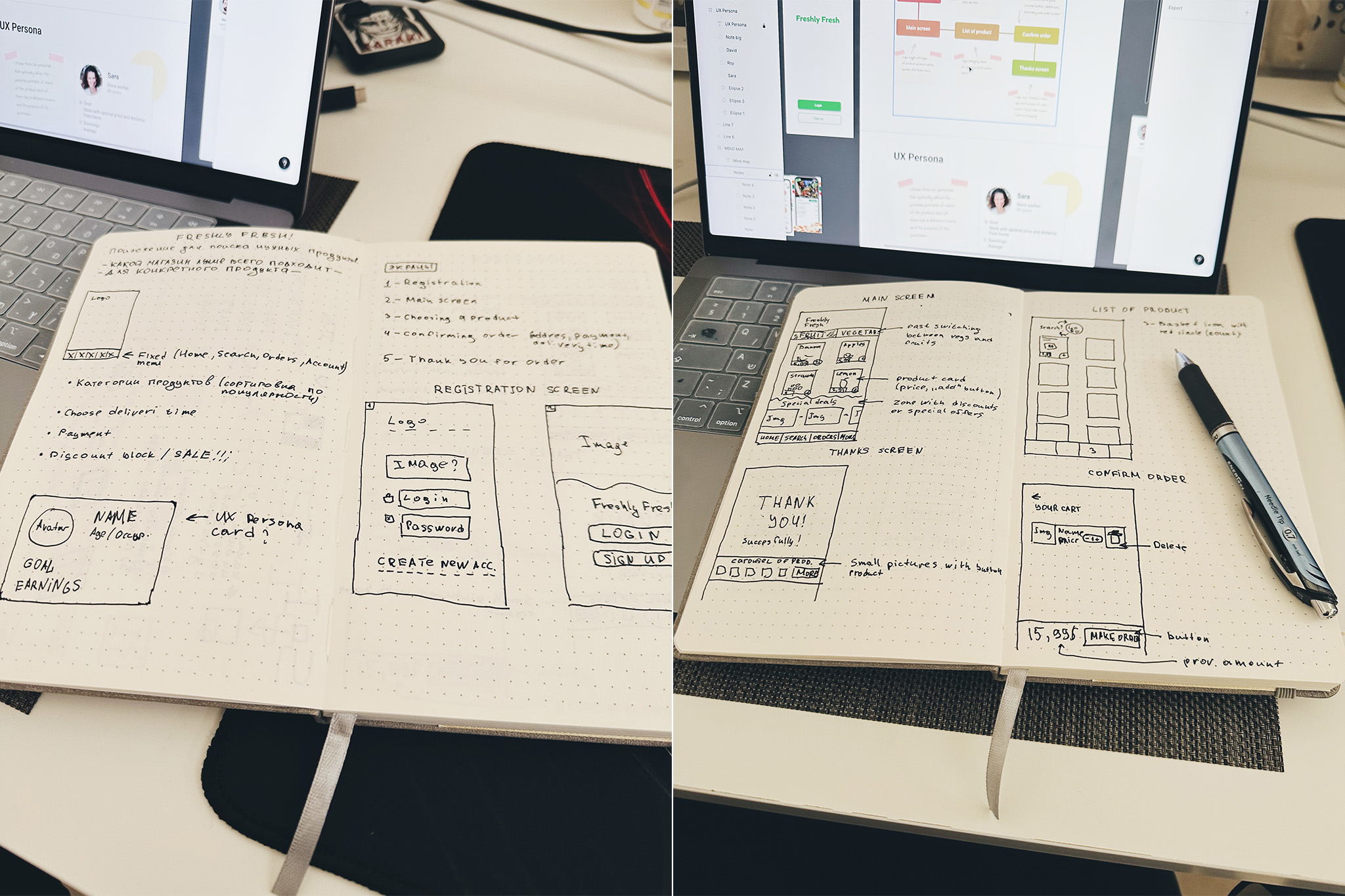
After Research, a preliminary “image” of the application has formed in my head, now you can start sketching and making notes in a notebook.
I chose the optimal number of screens that would reveal the application logic:
- Registration screen — we need registered users, because the application implies an order to a specific point, the possibility of payment. So this should be saved in the registered user’s profile
- Main screen — the main screen of the application. On it, we will place several products, a switcher, an area with special offers (we provide a service to marketers) and a menu.
- Products list — a catalog of products that we will select and add to Cart.
- Product page — a page with a product.
- Cart — our cart, where products go after the user’s choice.
- Thanks screen — after a successful payment, we want to thank the user for the purchase. I also immediately wanted to add a button when clicked on which the user can view his order.
I described part of the process on behance, and in this post I want to talk more about some “small” details 🙂
Button “Plus”
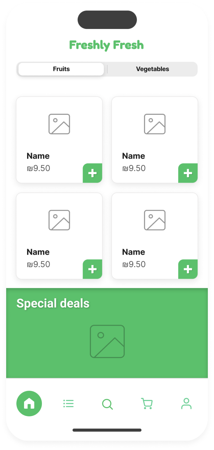
On this screen, the “+” button initially delighted me: it was 38px in size, which is ideal for tapping with a finger, and conveniently located on the product card. But! In the process, a problem arose – we have an application that differs from the aggregators we are used to, where we first select a store, and then we put the available goods in it into the basket. In my application, we first select a product, and then we select the best store for us (price, quality, distance). Therefore, this “+” button violated our application logic and had to be abandoned, although we really didn’t want to.
Product screen
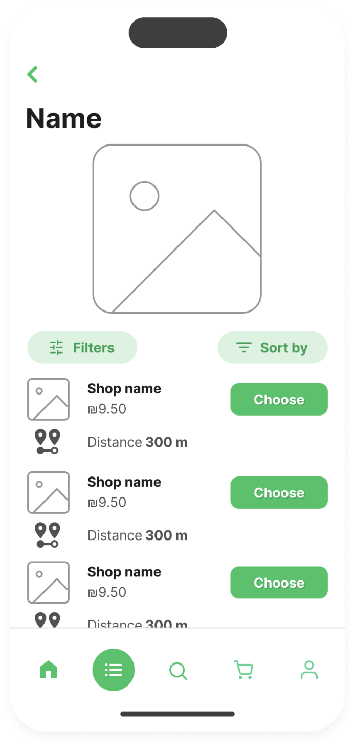
When designing the Product screen, it was important to show price and distance information from the user. Ideally, when a user taps on the Google dot icon, a pop-up opens with a map showing our store, opening hours, and more.
Yes, I could draw it, no problem, but the project is “student”, not real. In some way, a demo version of the project, the only purpose of which is to show the optimal operation of the application for a potential employer.
The Filters and Sort buttons ended up changing for us too: I moved them to the top of the screen and made them more compact. This saved space.
Cart
The original version of the Cart also changed quite a bit in the process towards habitual ux-patterns. On the one hand, I wanted to try to implement my idea: leave the “Add” icon and the “Delete” icon.
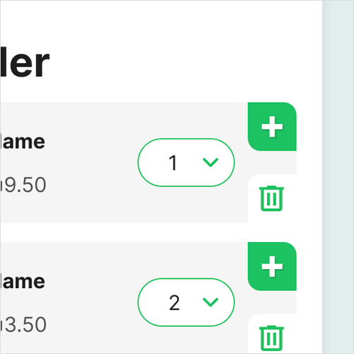
They were the optimal size for tap; there was an indent between them to avoid erroneous pressing; but everything was spoiled by dropdown with quantity. I didn’t like him, and perhaps I didn’t have enough experience to “beat” him competently.
I also added a block for entering promotional codes at the bottom.
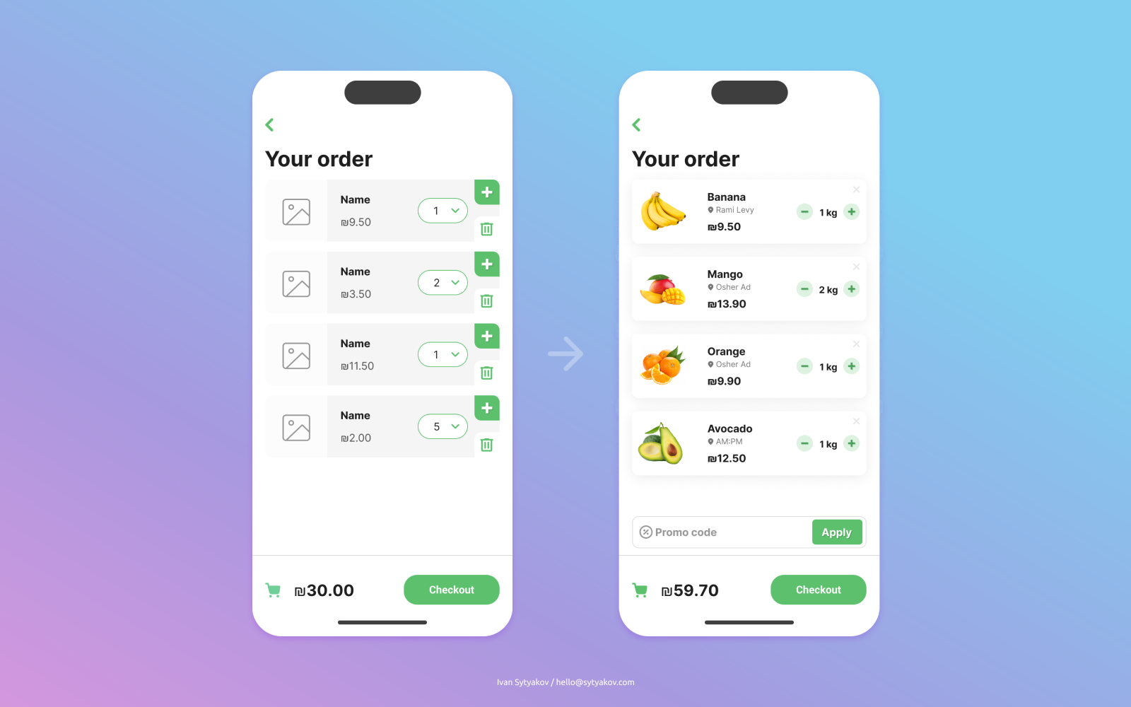
Toggle button
Working on this project, I gained important experience. One of those things is the toggle button. Since the app only offers the ability to order fruits and vegetables, I wanted to place a toggle button at the top, below the logo. However, in the process, the idea came up to add the “All” category so that the user does not constantly rush from one category to another.
Steps in toggle-button:
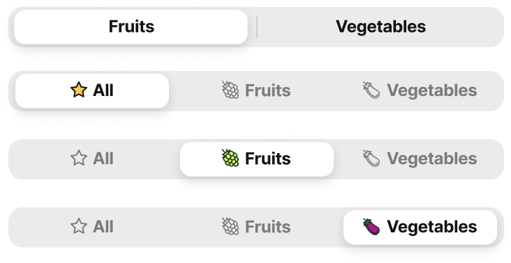
This is the final version:
Thanks for reading!
The first part you can read here — https://blabla.sytyakov.com/about-freshly-fresh-part-1/

