Intro
Two years ago, Apple released macOS Big Sur and added a new player icon to the menu bar. It provides access to all active applications that are currently playing something (music or video).
My user pain
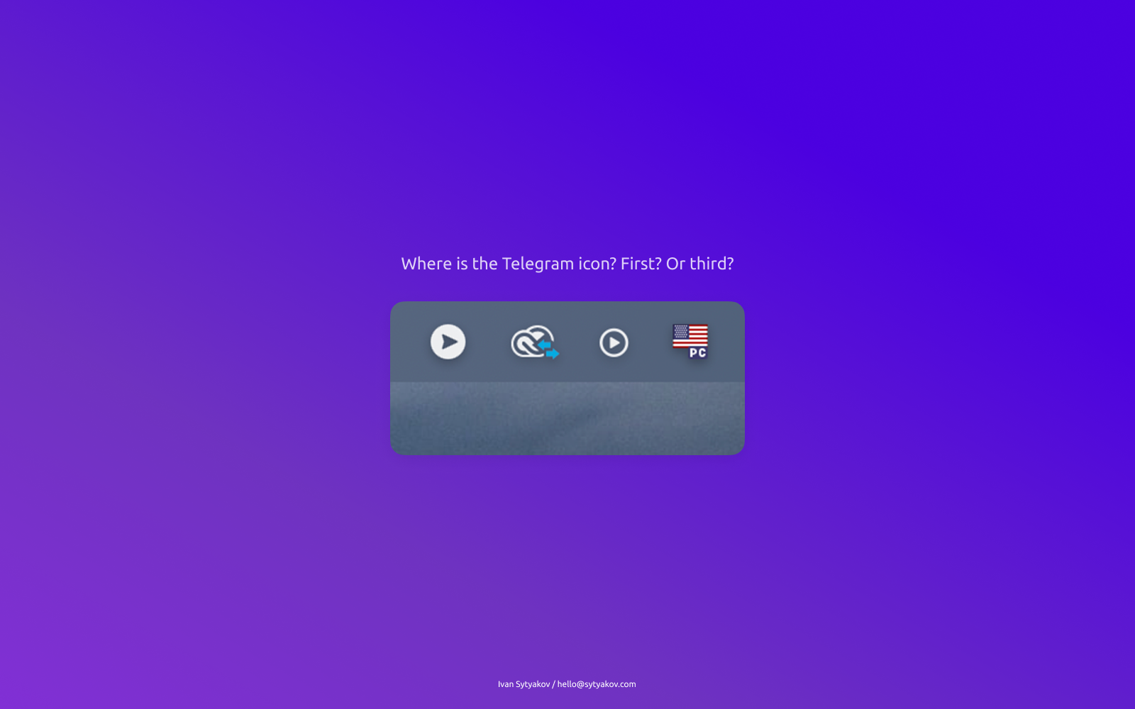
I actively use Telegram, and it’s almost always open on my computer. If the problem didn’t arise quite often, I wouldn’t write about it on my blog, but I still decided to share.
My Dock is set to automatically hide, and sometimes, to open Telegram, I move the cursor up to the Menu bar. And when I see two similar icons, a small confusion arises: which one is the Telegram icon here?

Okay, I have cheated a little and changed the angle of the Telegram icon. All to show the real similarity. In my opinion, Telegram’s designers chose an icon that isn’t quite successful. We all know that Telegram uses a paper airplane envelope in its logo, which has a clear cutout in the center. However, this cutout is absent from the application icon in the Menu bar.

Problem solving
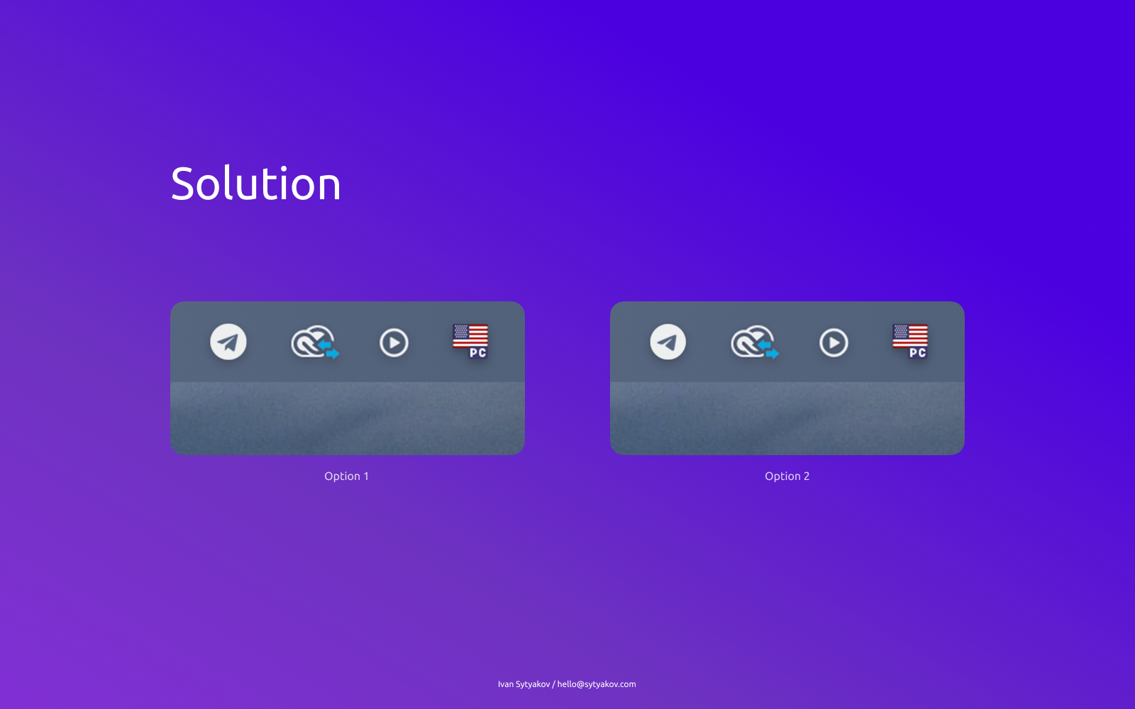
The solution to the problem is simple — replace the icon with a more recognizable one with a cutout in the center:

The cutout pixels aren’t “eaten up” by the small size of the icon, and it looks recognizable and not confusing.
