Introduce
In this post, I want to share my experience of developing the design of the application SoundSeeker.

Idea
The idea to develop an application for finding concert tickets was born spontaneously. Most likely I was very inspired by my wife’s gift, in the form of a ticket to a Disturbed concert, and from that moment on, as they say, it all began.
I won’t hide it, initially the motivation was in the form of “What’s there, what can’t I draw an application for finding tickets?”, but I’m very glad that this idea underwent good changes.
My (Designer) tools
Notebook
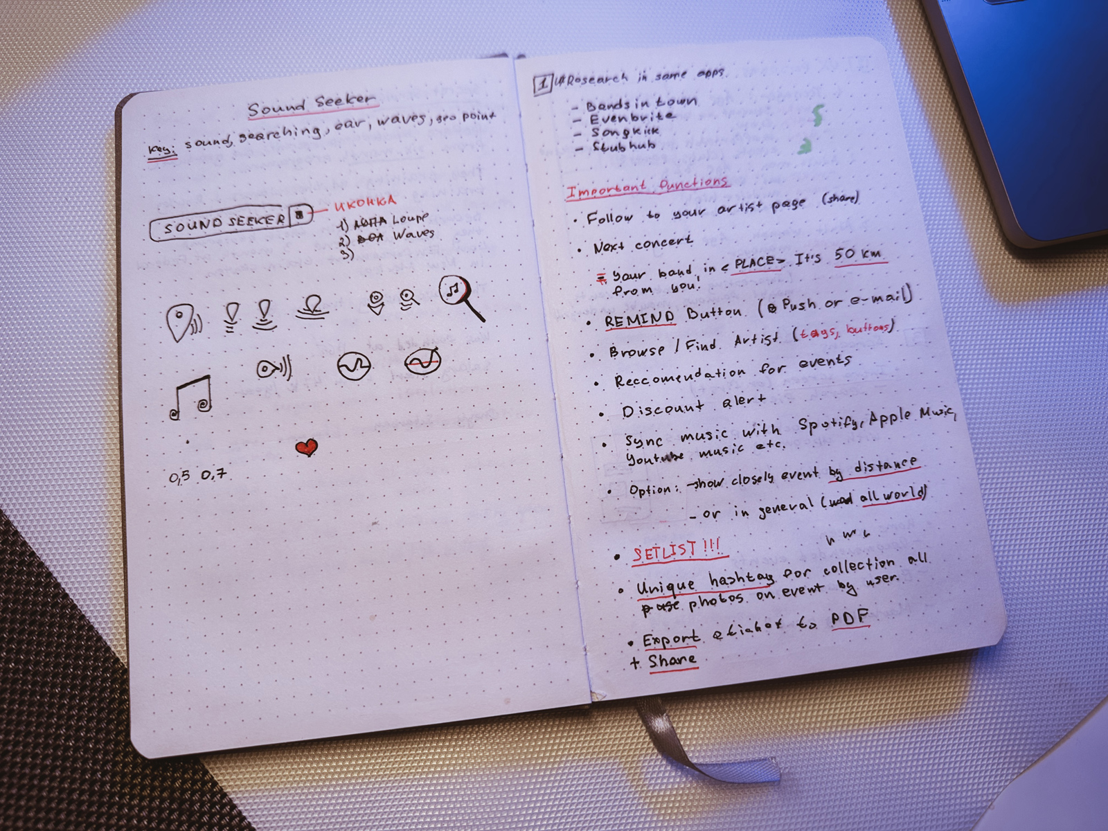
I start any project with notes in a notebook. If we talk about this project, then it all started with Naming. Let the application be fictitious, but I didn’t want it to overlap with the one already on the market.
Then I developed the Logo. The main idea for the logo was an attempt to combine musical attributes (sound waves) + magnifying glass (search).
Notion
In the next step, I try to keep my “chronology” in Notion: key information, project planning and process tracking.
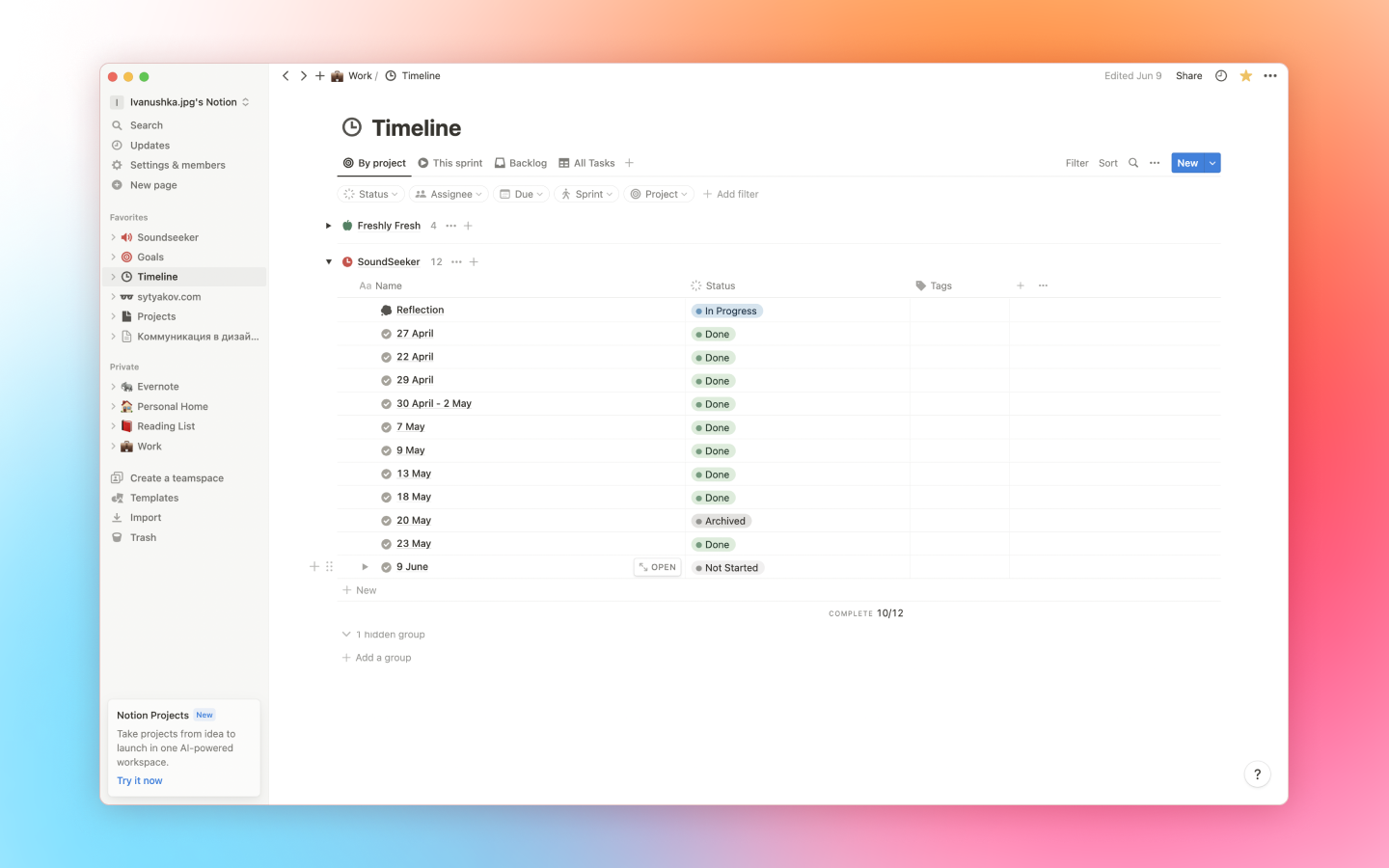
Regarding tracking — it was on the SoundSeeker project that I started to report on the work done: I created a note with the name of today’s date, where I wrote tasks that need to be done. What I didn’t have time to do, I moved to a future note. This allowed me to understand what I did and what needs to be done. And it’s just convenient to track the process.
Research
In the process of Research I explored several popular applications that are already on the market. All the solutions that I liked I painstakingly collected in Figma in the form of screenshots and made notes in a notebook. After that, a small analysis began on the topic of “what to keep, what to add” in SoundSeeker.
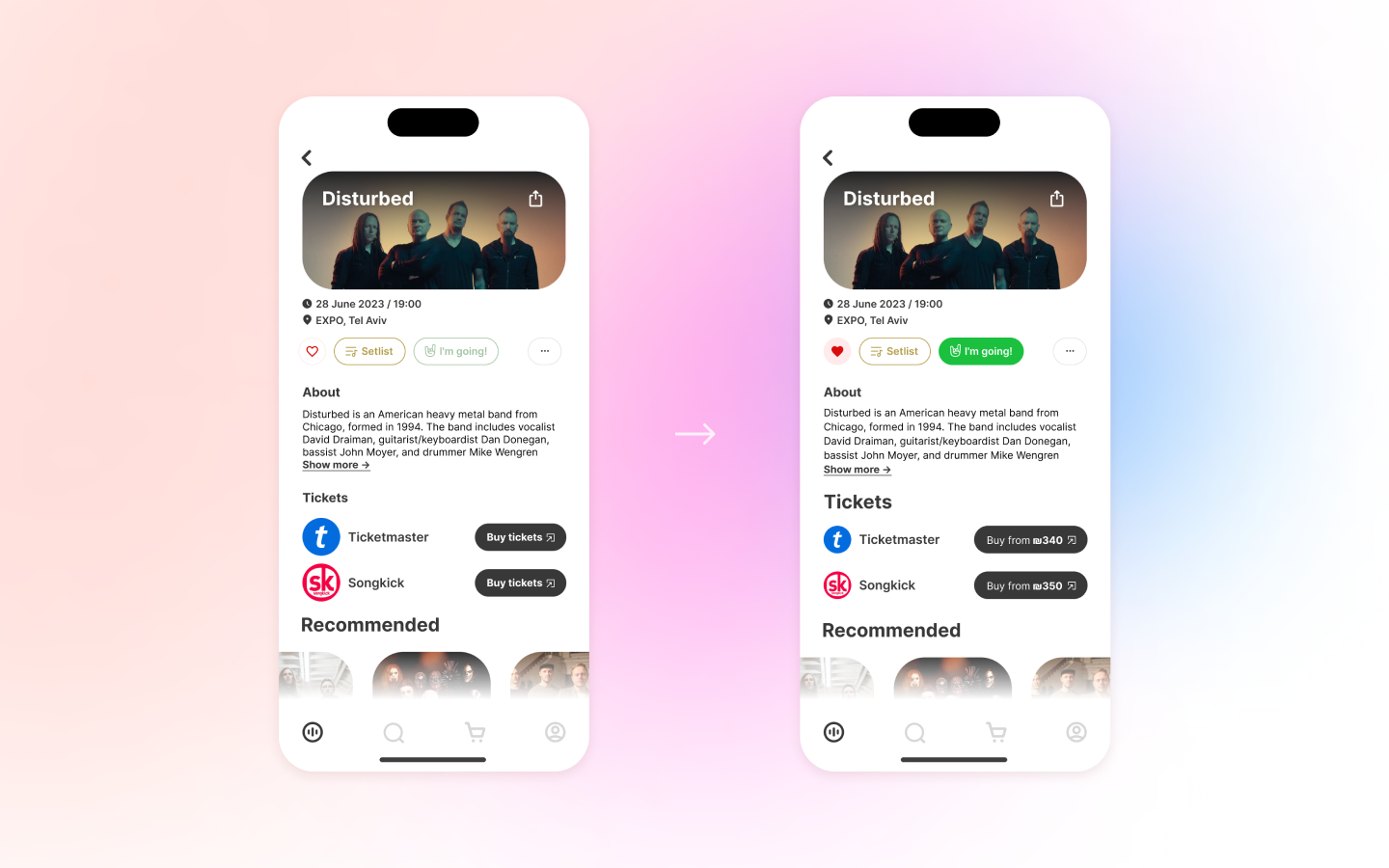
Challenge “How to implement price comparison function?”
One of my UX Persona was important to have the ability to compare prices for tickets from different services in the app. How to implement this? Based on the research I did, I saw what solutions are already available from other applications. In most cases, they use links or buttons to ticket sales services. But I wanted my user to know the price right now and not make unnecessary steps. So I came up with the following solution:
We can try to get this data (ticket cost) through the API of a third-party service and display it right on the “Buy” button!
Mentor
I came up with the “Setlist” feature right at the beginning of the project. I felt the need for it as a user and wanted to implement it.
What does the mentor have to do with it? The fact that until I got feedback from him, I didn’t ask the right questions to my application, as a UX Designer. The fatal phrase that changed my thinking was:
After this message, I started looking at my project from a different angle. I started asking myself questions:
I wanted my “fantasy” in the form of SoundSeeker to have real prerequisites for satisfying User Experience, and not just be a set of beautiful pictures on Behance. I no longer wanted to “just draw beautifully in Figma and come up with a few UX Persona, no big deal”, I really wanted to “spill out” in my application what others don’t have.
That’s how I came to the conclusion that with the “Setlist” feature, I can bring something new and unique to the user experience.
Optimization of the ‘Share’ function
We all love to stand out among friends. Perhaps, drawing inspiration from sports apps like Strava, I wanted to add a small portion of “showing off” to the “Share” function 🙂
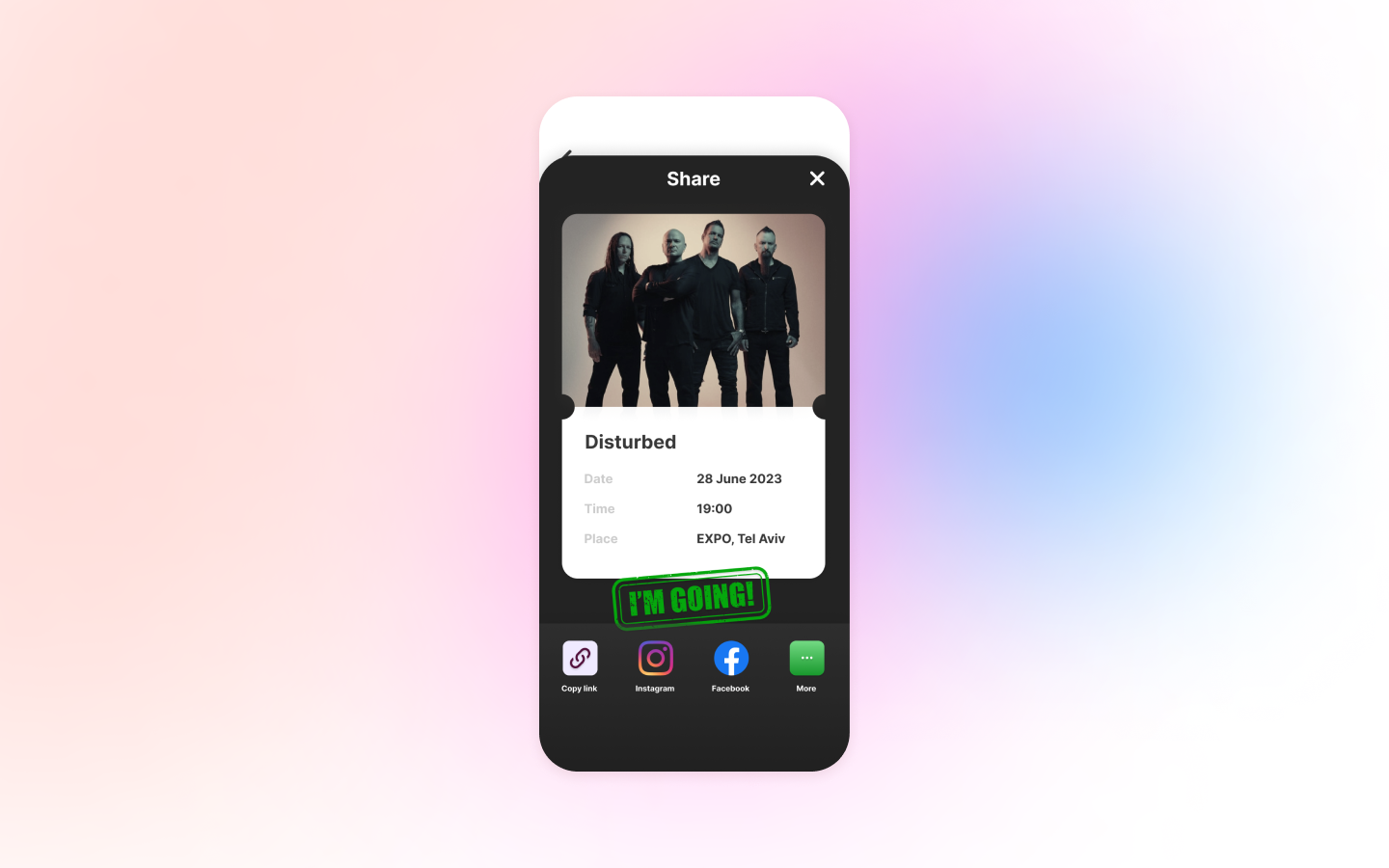
Of course, there’s room for further development with this feature: adding vibrant animations that can be exported into short clips for Instagram Stories. However, these are potential plans for the future.
What this project has given me?
I hope that my post was useful and interesting for you. If you have any questions or suggestions about my project, write in the comments.
Thank you for your attention and see you soon!

