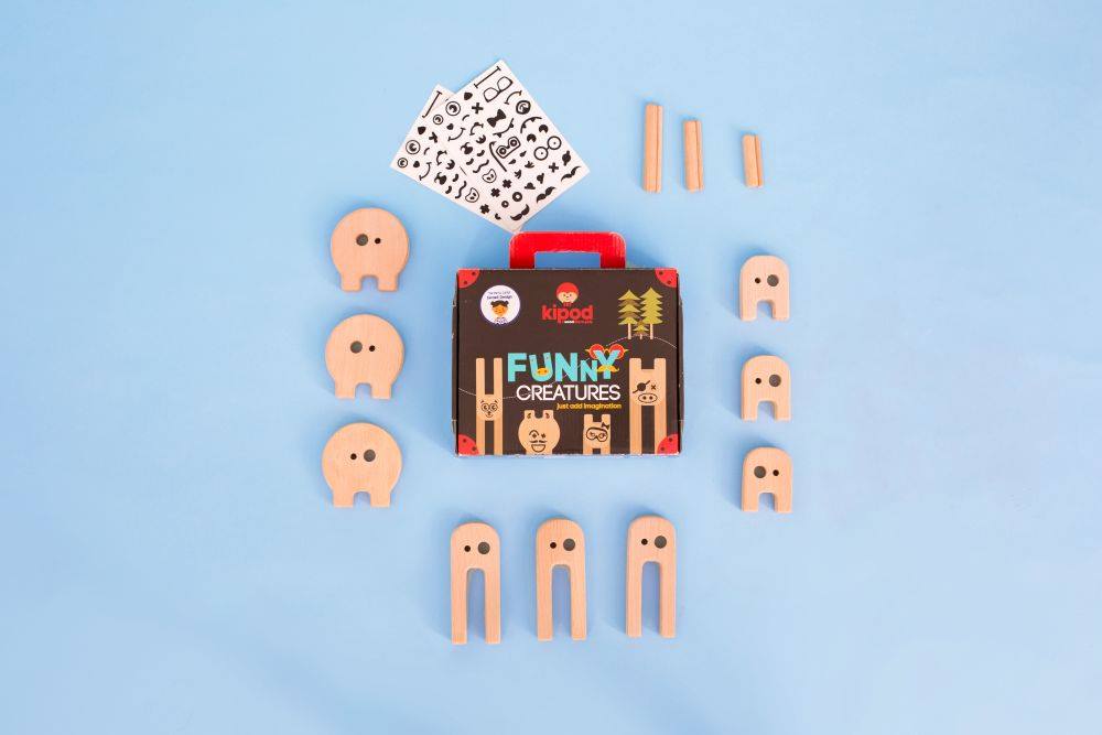
In April 2020, I did an internship at the Israeli company Kipod Toys. The company is engaged in the production of toys for children with a focus on the development of motor skills and imagination.
Problem / User pain
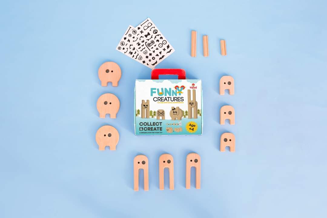
I want to share a case with the redesign of one of the company’s packaging. In this case, I want to focus on Problem-solving and User Experience. Yes, this is not a website or application, but similar tools are used here, like in UX design. I am currently actively looking for a job as a Junior UX/UI Designer and I need to show how I work.

Problem-solving
Colors
I decided to try using light colors in the packaging. I have putted an image with toys on center and removed distracting element’s. So we got a cleaner, less distracting design.
New element’s
The essence of the toy: collect different toy parts and get a unique version of the toy. Therefore, I designed and added the inscription “Collect & Create”. This inscription reveals and helps to understand the main message of the toy.
Also, I added a picture from the instructions with the assembly diagram of the toy, which also helps to solve the main problem – how this toy (product) works.

p.s. Sorry for low quality images, can’t find source files.

