Moovit is one of my favorite mobile journey planner app that I’ve been using every day for three years.
During this time, I have accumulated some “User Experience”, as well as some “pain” of the user.
And since I am currently actively looking for a job as a Junior UX Designer, I would like to show how I would solve these “problems”.
Let’s go!

On starting menu we see search field, last rides, block with advert and navigation buttons.
My user pain
The Navigation buttons are not fixed and disappear when you open the screen with a stop or route. And in order to quickly return to the desired section, I need to press the Back button once again. Or, for example, I have an active trip, but I want to see how my bus goes further (maybe it would be more convenient for me to get off at the next stop, and not at the one offered by the application?). To do this, I need to press the Back button, open the Lines tab, enter the desired bus number, etc. It’s tiring.
You can, of course, do a beautiful thing, such as a long tap on the map, which will add a line for the entire bus route, but this is not about that now:

Let’s get back to Navigation buttons. Navigation buttons disappear when I want to see my trip, or stop, or bus route. In their place, a block with payment appears.
The simplest solution is to lock the Navigation buttons and place the Payment block above. The downside of this solution is that the block with payment clutters up the part of the screen that displays important information (route map, list of buses). We can make a small optimization of the pay block:

We can move Report and Favorite buttons to Kebab menu.
We must leave the Pay button because it is important, and leave only icons for the Report and Favorite buttons (or moved them to the Kebab menu).
Also in the screenshot below, I changed the area with the name of the stop and its photo: by adding a photo to the entire background of the area, it is easier for the user to see the “landmarks” of the stop (to understand whether this is the stop that he needs). For convenience, you can also add opening a photo to full screen when you click on it or an icon.

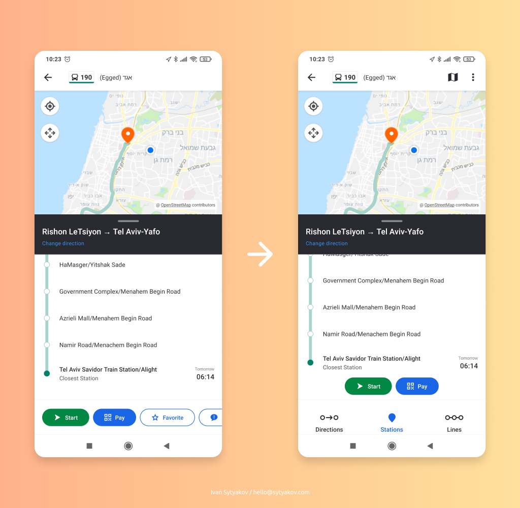
When viewing the full route of the bus, we are again faced with the main problem – the lack of Navigation buttons and even the Kebab menu. Solution:

In summary: simple changes will make the app easier and more convenient to use (I hope :D).

