We are all used to the fact that if any product belongs to Apple, then it is certainly a high-quality product, a standard in which everything is perfect. But!
This problem, which will be discussed in the post, I have met a long time ago, and I don’t understand why it is not fixed.
In UX design, there is such a thing as UX-patterns — these are patterns of repeated user actions in interaction with the product. A simple example: the close window cross is usually located in the upper right corner. The user will intuitively drag the mouse to it, even if it is not there.
It’s like looking for a light switch in a dark room by touch — we don’t see it, but intuitively remember where it is located.
My pain
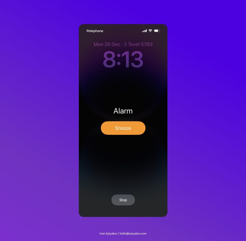
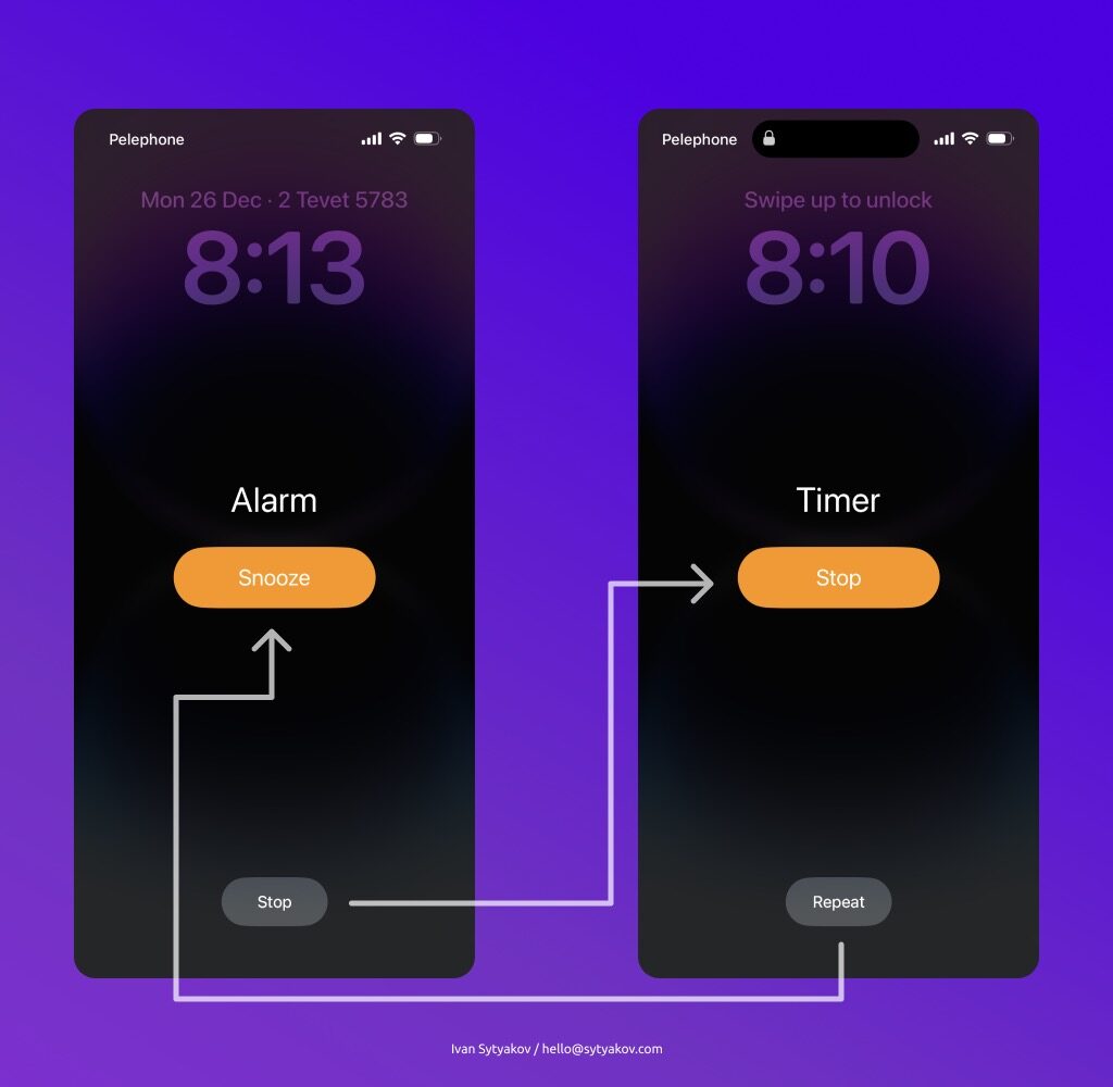
Every morning I wake up to the sound of my phone’s alarm clock. On the screen, I see only two buttons that are available to me — these are Snooze and Stop. The Snooze button is bright with an orange background. It’s much more visible than the little gray Stop button. Turning off the alarm every day, I have been developing a habit (UX pattern) that the big orange button will give me the opportunity to sleep for another 10 minutes, and the small gray one will simply turn off the alarm.

Everything is fine? From the outside it looks like yes, everything is fine, Apple experts know better. But (2)! 😀
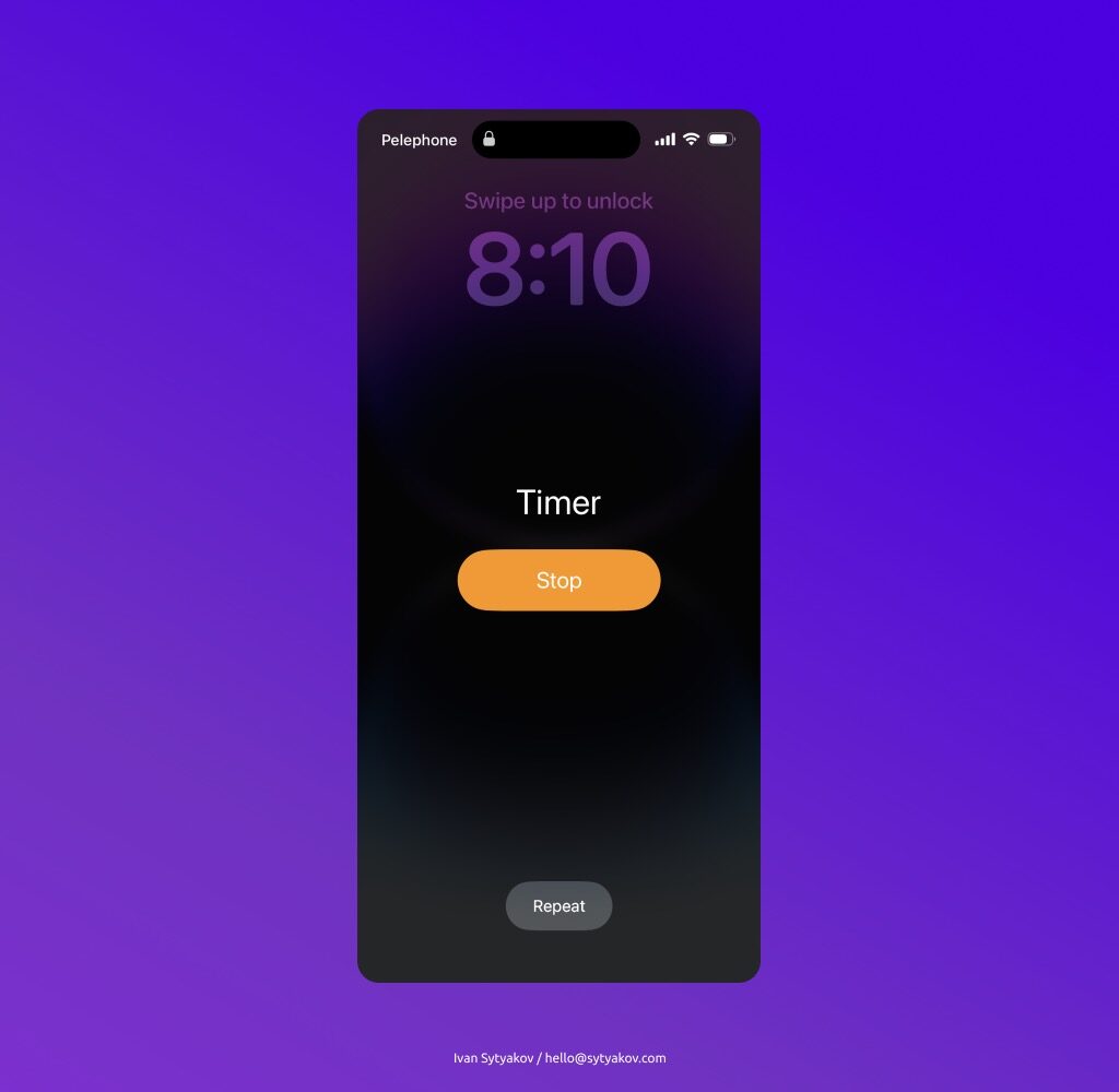
Once, I set my clothes to be washed and set Timer on my phone so that I would not forget to take them out at the end of the wash.
And when Timer worked, I clicked on the button Repeat out of habit (hello UX-patterns).

The habit has developed because I usually immediately turn off the alarm and get up. The fact that the familiar Stop button has moved and become large and bright surprised me. Two identical screens, but they decided to swap the buttons. In my opinion, this is wrong.

Solution
It is better to make the Stop button large and visible in both screens, and place Snooze and Repeat at the bottom. And there will be fewer frustrated users in the world who accidentally press the Repeat button when they want to stop the Timer.

